
As startups scale, small brand identity issues can quickly become growth problems. This article breaks down the most common mistakes – from inconsistent visuals to unclear tone of voice – and how to build a brand system that can grow with the business.
Brand identity mistakes don’t usually show up on day one. Ultimately, in the early stages, speed matters more than precision. You just need something that works – a logo, a website, a few slides to explain the idea. It doesn’t need to be perfect. It just needs to get you moving.
And for a while, that’s enough.
But as the business grows, the pressure on the brand increases. More people become involved, more touchpoints are created, and more is at stake in how the business is perceived.
What once felt “good enough” starts to feel inconsistent, unclear, or out of step with the quality of the product itself.
That’s when brand identity mistakes stop being small details. And start becoming growth problems.
Before getting into the mistakes, it’s worth being clear on one thing…
Brand identity is often reduced to visuals. A logo. A colour palette. A typeface. Maybe a few templates.
But at scale, identity does more than make a business look good. It makes it recognisable, consistent, and coherent across everything the company does.
It’s what connects your website to your product, your pitch deck to your marketing, and your social content to your sales materials.
When it works, the business feels coherent, no matter where someone encounters it. And when it doesn’t, things start to drift.
That drift is where most of the mistakes begin. Let’s get into them.
One of the most common startup branding mistakes is treating identity as something that sits on top of the business. Just something to make things look better.
But when a startup scales, identity becomes infrastructure. It’s what allows multiple teams, channels, and outputs to stay aligned without constant oversight.
If the identity isn’t built to support that, it starts to break under pressure.
You see it in inconsistent visuals, mismatched messaging, and teams creating their own versions of the brand because there’s nothing solid to work from.
Treat your brand identity like something people need to use, not just something people need to see.
That starts with moving beyond a logo and a colour palette, and building a system that can be applied consistently across the business — without constant input from a designer or founder.
In practical terms, that means:
When that’s in place, the brand stops being fragile.
Design decisions don’t need to be reinvented every time something new is created, teams don’t go off in different directions, and the business starts to feel consistent by default, not by constant correction.
That’s what makes identity infrastructure, not decoration.
Not sure when you should do this? Learn more about when the right time to rebrand a startup is in our latest article.
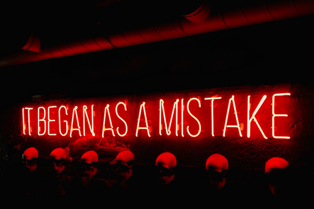
Another common mistake is jumping straight into design before the thinking is clear.
It’s understandable. Ultimately, design is tangible. It gives you something to show, something to launch, something that feels like progress. In fast-moving startup environments, that momentum is hard to resist.
But without clarity underneath – we’re talking positioning, audience, and the message – the identity has nothing to anchor it to.
So what you end up with is a brand that looks considered, but doesn’t communicate anything particularly meaningful. It might feel modern, or “on trend”, but it won’t explain why the business exists, who it’s for, or why someone should choose it.
That gap becomes obvious quickly.
Teams start filling in the story themselves. Messaging shifts depending on context. The website says one thing, the pitch deck says another. And eventually, the brand needs to be revisited – not because the design was bad, but because it was built on unclear foundations.
Before you get into design, you need to define the thinking that design is supposed to express.
That means getting clear on a few core areas:
This doesn’t need to be a long, theoretical exercise. But it does need to be explicit, agreed upon, and usable across the team.
A simple test: if different people in the business describe what you do in different ways, the strategy isn’t clear enough yet.
Once that foundation is in place, design becomes far more effective – because it has something to work with.
The identity can reflect the level of confidence you want to project. The colours, typography, and imagery can reinforce the positioning. The overall look and feel starts to support the message, rather than compete with it.
That’s when design stops being subjective, and starts doing a job. And this is why we ensure this step is done before doing any design.
When you’re building in a crowded space, like fintech, SaaS, health or climate, it’s natural to look at what others are doing. You study competitors, analyse their websites, and start to notice patterns.
Over time, those patterns become defaults.
The same colour palettes. The same product-led layouts. The same language around being “simpler”, “smarter”, or “built for modern teams” (cringing as I wrote those!).
At first, it feels like you’re aligning with the category. In reality, you’re blending into it.
And the more your brand resembles everything around it, the harder it becomes for anyone to remember you, trust you, or choose you – especially as the market becomes more competitive.
This is where many startups get it wrong. They treat branding as a way to fit in, when it should be a way to stand out within the category.
Because distinctiveness is what creates recognition. And recognition is what builds trust over time.
Start by understanding the category – then make deliberate choices about where you don’t follow it.
Look at your competitors and map the common ground:
That gives you a baseline. From there, the work is to create contrast in a way that still feels credible. In practice, that might mean:
The goal isn’t to be different for the sake of it, or to reject everything the category does. It’s to build a brand that feels familiar enough to understand, but distinct enough to remember.
That balance is what makes a startup stand out for the right reasons. Learn more about why branding is an essential investment, not an optional extra.
A brand identity that works at five people doesn’t always hold up at fifty.
At an early stage, the brand only needs to do a few things. It lives on a simple website, a pitch deck, maybe a handful of social posts. The team is small, decisions are centralised, and consistency happens naturally.
As the business grows, that changes quickly.
More people are creating content. New channels are introduced. The product becomes more complex. Different teams need to apply the brand across marketing, sales, product, hiring, and investor communications.
This is where early identity decisions start to show their limits.
A logo that only works in one format. A colour palette that’s too narrow to support different use cases. A visual style that looks good on a landing page but breaks down across a full product or campaign.
What once felt simple and effective starts to feel restrictive. And when that happens, teams either work around the brand – or ignore it altogether.
Design your identity with real-world use in mind – not just how it looks at launch, but how it needs to perform as the business grows.
That starts by thinking beyond individual assets, and considering how the identity behaves as a system.
In practice, that means:
It also means pressure-testing the identity early.
Apply it to a pitch deck, a product screen, a campaign, a social post, or even a hiring page. See where it holds up, and where it starts to break.
You’re not trying to predict everything. But you are trying to avoid building something so narrow that it needs to be reworked the moment the business grows.
A scalable identity doesn’t add complexity. It removes friction – because it gives your team something they can use, extend, and rely on as the company evolves.
This is where most brand identity issues stop being internal – and start becoming visible to everyone else.
At an early stage, consistency is easy. A small team, a handful of channels, and usually one or two people responsible for everything brand-related. The output might not be perfect, but it feels connected.
As the business grows, that changes.
And without a shared system in place, each of those outputs starts to drift – not dramatically, but just enough to make a real difference to the bottom line.
The logo gets used slightly differently. Colours shift depending on the tool. Typography becomes inconsistent. Imagery styles vary. Tone of voice changes depending on who is writing and where it’s being published.
Individually, these things are easy to overlook. But together, they create a fragmented experience.
To an outside audience, the business starts to feel less coherent, less considered, and ultimately less trustworthy – even if the product or service itself is strong.
Consistency doesn’t come from telling people to “stick to the brand.” It comes from giving them the tools to do it properly.
That means turning the brand into something usable, not just something defined.
In practice, that includes:
Just as importantly, the system needs to be visible and adopted. If it lives in a folder no one opens, it won’t work. If it’s too complex, people will ignore it. If it’s not introduced properly, teams will continue doing what they’ve always done.
A good brand system reduces decision-making, it gives people confidence that they’re doing it right, and it ensures that as more people contribute to the brand. Ultimately, everything still feels like it’s coming from the same place.
Something important to remember: consistency isn’t about control, it’s about making the brand easier to recognise, easier to trust, and easier to scale.

Brand identity isn’t just visual. It’s also verbal – and for many startups, that’s where things start to fall apart.
Early on, tone of voice is often informal and instinctive. Founders write the website. The team picks up the language naturally. It may not be documented, but it feels consistent enough.
As the business scales, that changes.
Why? Because more people are writing – across marketing, product, sales, hiring, and support. Different channels require different nuances, and without a clear definition of how the brand should sound across every touchpoint, everyone fills in the gaps in their own way.
The result is a brand that looks cohesive, but sounds inconsistent.
Formal in one place. Casual in another. Clear on the homepage, vague in product copy. Confident in sales conversations, but generic in marketing. Individually, these differences seem small. But over time, they dilute the brand’s clarity and personality.
Treat tone of voice as part of the brand system. Not an afterthought.
That means defining how the brand communicates in a way that can be understood and applied by different people across the business.
In practice, that includes:
It’s not about scripting every sentence. It’s about giving people a clear sense of how the brand should feel in words.
And when verbal and visual identity are aligned, the brand becomes much more recognisable. It feels intentional, consistent, and easier to trust – no matter where someone encounters it.
At Studio Anewe, we treat tone of voice as a core part of the brand system, not a layer on top of it. We define how your brand communicates in a way your whole team can actually use – alongside the visual identity – so everything works together, not in isolation.
That also extends to how teams are working today. We create tailored AI prompts and frameworks that reflect your brand’s tone, so content can be produced faster without losing consistency – and without falling into the generic “AI slop” that so many brands struggle with.
Startups tend to fall into two camps when it comes to branding.
Some invest too early, before the business is clear, and others wait too long – holding onto an early-stage identity well past the point where the business has moved on.
At the beginning, that early brand does its job. It helps you get to market, explain the idea, and gain initial traction. It doesn’t need to be perfect, just good enough to move forward.
But as the business evolves, expectations change. The product becomes more refined. The audience becomes more demanding. The stakes get higher – whether that’s larger deals, stronger competition, or more scrutiny from investors and hires.
And if the brand doesn’t evolve alongside that, a gap starts to form. The business moves forward, but the way it’s presented stays behind.
That gap isn’t always obvious internally. But externally, it shows up quickly – in missed opportunities, slower sales cycles, difficulty attracting the right talent, or a sense that the company feels less established than it actually is.
The key is recognising when the brand has become a limiting factor, and acting before it starts to hold growth back.
There are a few common inflection points where this tends to happen:
At these moments, the brand shouldn’t just be tweaked. It should be reviewed properly, with enough distance to assess whether it still reflects the business today, and supports where it’s going next.
In practice, that means:
The goal isn’t to reinvent the brand for the sake of it. It’s to make sure the brand is doing its job and helping your business grow.
Most brand identity mistakes don’t look like major problems at first. They tend to show up as small inconsistencies – a deck that feels slightly off, messaging that shifts depending on context, visuals that don’t quite line up. Individually, they’re easy to overlook and even easier to work around.
But as the business grows, those small gaps start to compound. More people are involved, more touchpoints are created, and more decisions are made without a clear foundation to guide them. Over time, the brand begins to feel less coherent than the business actually is – not because the company lacks direction, but because the way it’s presented no longer reflects that direction clearly.
That’s the point where identity stops being a design issue and becomes a growth one.
A strong brand identity doesn’t just make a startup look better; it gives the business a consistent way to show up as it scales. It allows different teams, channels, and outputs to reinforce the same idea, rather than pulling in slightly different directions. The result is a brand that feels clearer internally, more recognisable externally, and more trustworthy overall.
Because as your startup grows, more people will encounter your brand before they ever speak to you – and in that moment, what matters isn’t just whether it looks good, but whether it communicates the right level of clarity, consistency, and credibility to move them forward.
More insights
